They say Rome wasn't built in a day, but from the looks of it, many of these places must have been. From airports to hotels to public transport stations, cheap, inefficient, and downright tasteless designs can be found in public places around the world, and we've rounded up a few of the worst offenders. Some of them were probably honest mistakes, but a few had us scratching our heads and wondering how they were ever possibly approved. From missing slides to ugly bathrooms, scroll on to check them out.
Well, This Is Awkward
Be sure to proceed with caution should you ever need to use the toilet at Pearson airport in Toronto. Each bathroom has a man or woman figure pictured outside of it, but the genders are reversed according to the sign above the entrance, so it's not entirely clear which room is which. We imagine this has led to a lot of uncomfortable moments when travelers accidentally choose the wrong room.
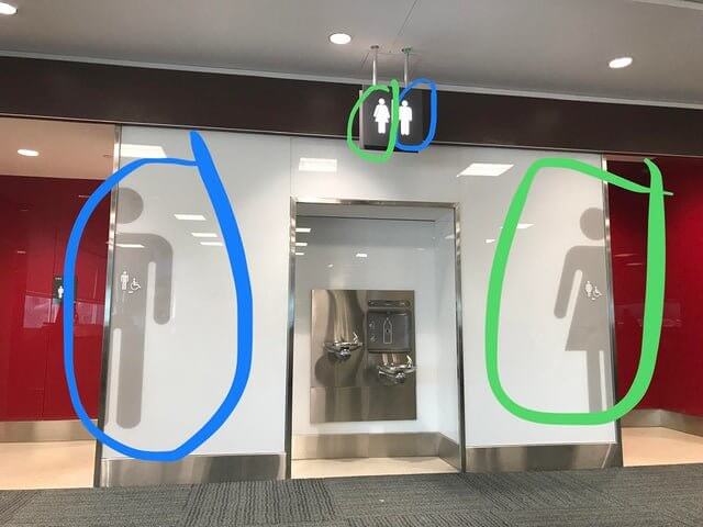
If women accidentally enter the men's room, they'd at least likely see the urinals and realize rather quickly. A man could enter the ladies' room and not realize right away if it were empty.
Useless Railings
From the looks of it, nobody working on the construction of this sidewalk really understood where everything was supposed to go. The railing was probably supposed to be a guardrail to prevent anyone from falling over the edge, but for whatever reason, some of the workers put it in the one place where it would serve no real purpose and thought to themselves, "yeah, this looks right!" Maybe we just don't understand construction.

Some people have argued that the railing's purpose is to catch debris and prevent it from falling into the drain, but if that's the case, it's not even properly installed.
Eye See You
Whoever was responsible for designing this poster to advertise for Senior's Day probably should have checked out the space they'd be displaying it on first. Poor Grampa; he was probably looking forward to his 15 minutes of fame. We can imagine the surprise we'd feel if we'd posed for a picture and later discovered that this was the result. But what do we know? Maybe he thought it looked cool.

He does look kind of like a cyborg or even some sort of pirate. If anything, it's a picture that people will remember and hopefully help bring them out for Senior's Day.
An Unnecessary Door
Correct us if we're wrong, but isn't the point of a door to like, create a barrier between spaces so as to prevent people from entering or seeing what's on the other side? If so, the interior designers of this hotel really missed the mark. This door is at the top of a flight of stairs, but it seems to serve no real purpose. If anything, it's just an inconvenience.

It would be easy to peek your head around and see what's behind the door, and if you're really motivated, you could probably even go around it by climbing over the railing.
Orange Is the New Milk
Doesn't anyone review these things before they get blown up into giant posters and plastered on the wall? This designer had one job, and it's not even an especially intricate poster. It's literally a white background with the word "Milk" and a glass filled with liquid. At no point in the process did anyone notice that the glass is filled with orange juice? Unless it is milk and there's something very, very wrong with it.

Maybe white liquid just didn't stand out enough against the background, but they could have easily fixed this problem by including an & symbol and the word Juice' next to Milk.
Not Quite
While we can't deny that coffee and donuts do make an especially delicious pair, the creator of this poster happened to choose a design that does not display that very effectively. All they had to do was paste one of the images into a puzzle piece template with holes, but instead, they went with two of the exact same puzzle pieces that in actuality do not go together at all.

They also could have picked a better font and images to paste into the puzzle pieces. These pictures cut off in weird places and make it difficult to see exactly what is being advertised.
An Unhelpful Address
We actually don't hate this, we just think it could have been done better. The numbers look kind of cool, and we like the way the font looks painted on the brick, but there needed to be some way to identify which way they're actually facing. Is the address 6989 or 6869? They could have included the street name in small print below or above to make it clear which way is correct.

They could have kept the font and cleared up any confusion by just writing the numbers vertically instead. We feel bad for the mail delivery people who have to deal with this nonsense.
A Crappy Toilet
We move to make toilet seats with this kind of design illegal. It takes a person with no foresight to create something like this and think, "That looks good!" It's supposed to be some kind of floral design - it looks like dried flowers encased in a clear resin, but they really should have gone with more colorful flowers. Or large onesr. Or both. What was the person who chose this for their house thinking?

Also - this picture was posted on a real estate site. Who on earth in the process of buying a house is looking for such close-up pictures of the toilets?
False Advertising
Walgreens, coming in strong with the majorly-inconvenient product advertisements that no one asked for. They added screens to the freezers at some stores that theoretically show what products are inside. The problem is, the images move, flash, and don't accurately represent what's behind them. We can't imagine this is any fun for customers looking for a particular product, or for the store employees who are responsible for keeping the shelves stocked.

This seems like a major waste of advertising dollars. If we were at Walgreens looking for a specific brand of ice cream, the image of another brand wouldn't do much to change our minds.
In Case of Emergency?
The text over the key most likely originally said "break glass for key," but the loss of the 'f' changes its meaning entirely. Regardless, why not just break the glass over the extinguisher directly if you have to go through the trouble of breaking any glass at all? It doesn't even look like there's a hammer to help with this process. You'll put out the fire, but cut your hand in the process.

It's probably intended to be just difficult enough to take out the extinguisher that nobody will be tempted to mess around with it, but in an emergency, we'd imagine it's rather inconvenient.
Thanks, but No Thanks
In theory, we'd appreciate any city that took the initiative to install bike lanes for its residents. Traffic can be frustrating, and the costs of owning a car can really add up. This makes no sense, though. The municipality installed a bike path in such a way that it intersects with a curb too high to ride over. Bikes would need to get off their bikes and walk them around in order to pass.

What's even worse is that they could have installed it like, two feet to the left and avoided this problem. They should have at least painted the bump a different color.
Form Over Function
The design of this room is undeniably beautiful, but from the looks of it, the stairs pose certain danger. The material they're made of and the angle that they curve combined are a recipe for disaster. Also, don't even get us started on those metal ducks waiting at the bottom. You're almost asking to get impaled. You'd be better off using them as a slide than trying to walk down them normally.

Come to think of it, that actually sounds like a fun idea. We're not sure if this is someone's house or a public place, but with stairs this dangerous, sliding should be an acceptable method.
Worst Park Ever
Sure, it's unlikely that this park was intentionally designed this way and the slide was probably removed (or stolen) for some reason, but since we don't actually know what that reason was, we're going to pretend this was a very poor design choice and a dangerous one at that. The children who would have enjoyed the slide don't know the difference. We'd suggest sticking with the swings at this place.

Apparently, this is actually a fairly common phenomenon when slides are made of steel. It's a high-quality material that people are able to sell for money, so people... 'steal' them.
A Tight Squeeze
Sometimes architects and designers need to find ways to make the most of tight spaces, but this is a little much. It's possible that the shower doors are able to fold up to make more space, but since the original poster didn't say anything about that, we have to assume using the toilet in this hotel bathroom is a bit of a challenge. At least everything is clean, we'll give them points for that.

The poster also referred to this bathroom as "the worst they'd ever seen," and while we have to agree it could certainly be more spacious, there's really much else wrong with it.
No Way Out
Somebody call Kevin Costner because it seems like there's no way out of this parking garage. Two arrows and a sign are all pointing in the same direction, but it would only take one person deciding to follow the opposing arrow to cause what could be an incredibly destructive collision. Maybe they hoped drivers would assume that 3 arrows all pointing the same way would cancel out the other one.

There has to be a way to cover up the middle one, either by painting over it or using something to remove it. We wonder how this kind of mistake happened in the first place.
How Not to Sell Clothes
If we were looking to buy new clothes, this would probably be the absolute last place on earth we'd want to go shopping. Aside from the obvious, the worst thing about this display is that it's entirely unnecessary. There have to be (and there are) clothing display methods that are even somewhat less shocking and offensive. Who was the person responsible who thought that this was an appropriate way to use mannequins?

The only situation where something like this could even remotely make sense is a costume shop around Halloween. Clothing shop owners, take note please: do not display your products this way.
World's Worst Haircut
The phrasing is bad but the image is worse. While there's nothing wrong with this salon wanting to advertise that they cut children's hair, they really should have run this poster by like, anyone, before deciding to display it. Anything this awful could not have been approved by any person with an ounce of sense, otherwise, it wouldn't exist. This isn't even the proper way to give a child a haircut.

It really does look like the stylist is about to cut into that poor child's head, and the crying expression on his face is not helping. Take your kids to another salon, people.
Don't Eat That
We love poke as much as the next person, but this is a graphic design fail if we've ever seen one. The word is supposed to be spelled with the letter 'o,' but this designer decided to replace it with a picture of a bowl. Fine in theory, but poor in execution. The shape of the bowl looks much more like a 'u,' implying there's something much less tasty inside.

They could have easily remedied this flop by including a bowl from a verticle angle instead of one from the side or at least filling the 'bowl' with a round scoop of rice.
How to Miss a Flight
The logical explanation for these airport signs is that the gates are located in a circle around the concourse and gates 5 and 6 are located in the middle. They're probably just about equal distance regardless of which sign the traveler follows, but this was an unnecessarily confusing way to depict that. They should have just written gates 1-5 on one sign and 6-9 on the other to simplify things.

If we were in a hurry to catch a flight, this would definitely slow us down. We can imagine that many passengers have had to do a double-take while figuring out where to go.
Privacy, Please?
This high school bathroom is our worst nightmare come to life. Have you ever dreamt you needed to use the toilet but couldn't because the only place available was too exposed? It's a fairly common dream, but we'd never have imagined something like this could ever exist in the real world. We can't even being to understand why anyone would design a restroom this way. Why even bother with the walls?

Isn't high school already embarrassing enough? No one needs to be making things more awkward with stuff like this. We hope that there are some more private stalls available, at least.
Poor Planning
Good luck getting anywhere if you ever have to drive around Lake Tahoe in the winter. The city switched all of the traffic lights to LED bulbs, which don't produce much heat, and they chose a design that does not prevent snow from accumulating in front of the lights. This was the result, and while we're all for using eco-friendly light bulbs, they should have at least considered how to prevent this from happening.

People travel from all over to go skiing in Lake Tahoe, so this kind of thing must be a major inconvenience. The city should at least install some little heaters to melt the snow.
Lights, Ceiling, Action!
There had to have been a better way to light this room than with 40 small, rather dim ceiling lights. What could possibly have prevented the designer from choosing some lighting fixtures that would have more effectively lit up the space? It looks like an airport runway on the ceiling, and they aren't even evenly spaced. It looks like a room from the houses we used to build playing The Sims.

It's bad enough that there are so many of them on the ceiling itself, but to have them on the verticle wall too is just excessive. They should have gone with pendant lights.
Bloody Hell, This Counter!
This granite was probably the worst possible choice the designers could have made for this bathroom. It kind of looks like there's blood spattered everywhere, and given that this is part of a doctor's office, they should have had the foresight to choose something else. It reminds us of a picture that went viral a few years ago of a children's hospital designed with what looked like a bloody trail on the floor.

Some people argued that it was an example of color theory - red is supposed to be bright and cheerful, which is fine in theory, but the execution needed some work.
Watch Your Step
Architects, engineers, and city planners really need to start consulting with actual people with disabilities if they're trying to make places more accessible. This attempt to help the visually impaired by installing some tactile markers on the ground was made almost completely useless by the installation of a weird, UFO-esque bench. They could have easily put the bench just a few feet to the side and avoided this problem entirely.

The benches must have been chosen for aesthetic reasons - they do look kind of cool, but they also don't look particularly comfortable. They can't be very good for your back.
Barely a Bike Path
And here, we have yet another example of what poor city planning looks like. Why bother creating a bike path if you're not going to take down all of the trees and telephone poles in its way? We're all for 'leaving' trees in their place, but this is just stupid. They could have at least made the path wide enough that bikers have enough space to ride around all of these obstacles.

It's not just stupid, it's also dangerous. It's one thing to have to walk around an obstacle, but it takes longer for bikers to slow down and dismount from their bikes.
Blurred Lines
God help anyone without perfect vision should they ever have to walk on this sidewalk because the picture alone is giving us a headache. The idea of using different colored bricks to create a striped pattern is all well and good, but the city planners should have stuck with just black and white. Those gray squares in between make everything look blurry and create the illusion that the ground is vibrating.

It kind of looks like an example of a technique known as spatial anti-aliasing, which is used to minimize distortions in high-resolution images when they're displayed at a lower resolution.
Peek-A-Poo
How to Encourage Creeps to Frequent your Establishment 101: have a garbage bin peep hole that provides a direct view to the bathroom stall next to it. Maybe it broke, or maybe this is just the world's worst design flaw, but either way, it needs to be changed or fixed immediately. There has got to be a better way for people to pass toilet paper or other necessities back and forth.

Not only is this a great way to make people incredibly uncomfortable, it's also a lawsuit waiting to happen. We hope that no one's privacy has been invaded because of this.
Truly Crappy Design
If the bloody counter was bad, this one is 100x worse. We dare not even mention what it looks like was... smeared, for lack of a better term, all over it. A counter like this would be awful in any room, but in a kitchen, we'd at least maybe think it was chocolate. This design never should have seen the light of day, let alone have been chosen for a bathroom sink.

The only benefit to this is that you may as well not bother to actually clean the bathroom because no matter what you do, it's going to look disgusting anyway.
Barely a Bar
It's like there's a glitch in the building. We're assuming that this wall had already been put up at the time the railing was installed - it wouldn't really make sense to build a wall around the stairs, but either way, this is a rather odd result. No one involved in the building design could see that the angle of the stairs was going to directly intersect with an existing structure?

And instead of installing a railing that would work with the wall, they decided to just leave a two-foot gap in the rail. Seems like a very safe choice, indeed.
Who's Going to Know?
While we can recognize that the makers of these bus buttons at least tried to make them useable for the visually impaired, upon closer inspection it became clear that their efforts were unsuccessful and may have actually done more harm than good. The braille on each button is exactly the same and given that they alert the driver of very different things, this could be an accident waiting to happen.

The dots create the braille letter "S" which makes sense for STOP, but much less so for ALARM. The manufacturing company saves money by changing just the color of the buttons, not the shape.
Clean Up on Aisle 12!
We could create a whole article on bodily fluid-inspired bathroom design alone. We've had bloody and crappy counters, a toilet seat with brown spots, and to round it all out, we've now got what appears to be floor tile with blood smeared all over it. The shiny grayish-silver color of the tiles is actually quite nice; why did they have to go and ruin it with this weird red splotch?

Like the infamous children's hospital image, this is another example of how color theory does not exist in a vacuum. A different red design or this design in another color would have been much better.
Slip and Slide
In recent years, city planners and law enforcement in cities around the world have put a great deal of effort into altering existing structures to deter homeless people from staying in certain areas. Aside from the moral issues with this, which are greater than we have time to unpack right now, the changes have also made many of the structures unsuitable for any person to use, whether they're homeless or not.

These benches in Liverpool are a great example. Sure, it'd be hard for anyone to sleep on a platform with this angle, but the beach is too steep to even sit on.
WHAT Kids Neighborhood?
Good intentions, poor execution. This sign is supposed to bear the name of a kids' club called Nazareth Kids Neighborhood, but for whatever reason, maybe to save space, they decided to go with 'Naz' instead. Fine in theory, but the addition of little children climbing and playing on the letters gives the sign a whole new meaning. One child in the wrong place ruined the whole thing. How did no one notice this?

It's less offensive, but the 'D' on the sign wasn't designed very well, either. It appears to have fallen sideways and a child is standing on it, kind of making it look like an 'S'.
Room With a View
This might be the worst bathroom of all, mainly given the fact that the door is completely useless. Seriously, why bother even putting a door if this is how you're going to do it? Might as well save the money and just forego doors entirely, or get a key and make the bathroom single-use. We didn't even know they made doors this short. The other half of it has to be somewhere.

It looks like they've actually taken a wooden door and just slapped it over the stall. There's no way this was part of the original design. It doesn't make sense with the space at all.
Do Not Open
Should you ever need a really secure hiding place, this spa in Austria has just the spot. That is, if you can get it open. We have to assume that the door was there before the railing was installed, but there must have been a better way to do it so as not to render the door (and the space behind it) completely useless. This could have been solid storage space.

Older buildings were often built without certain structures they're now legally required to have. Building codes weren't a thing when this spa was built; guests slipping down the stairs was a sign of the times.