All existing information or knowledge is represented in some form suitable for better usage or processing. Or simply put everything is data. When we think of data most people would imagine a bunch of numbers and statistics. But data is fun, beautiful, and is in every fiber of our lives whether we notice it or not. Most people didn’t like statistics in school because the teachers didn't know how to make it fun for us! This article is a collection of 40 charts that will blow your mind and show the fun in stats. Now, let's switch our nerdy mode on and enjoy the charts!
1. Expecto patronums.
We often watch movies that are based on books but we don’t read the book. Books always tend to tell a different story, a story our imagination can paint. This allows us to develop our own ideas and feelings towards the characters.
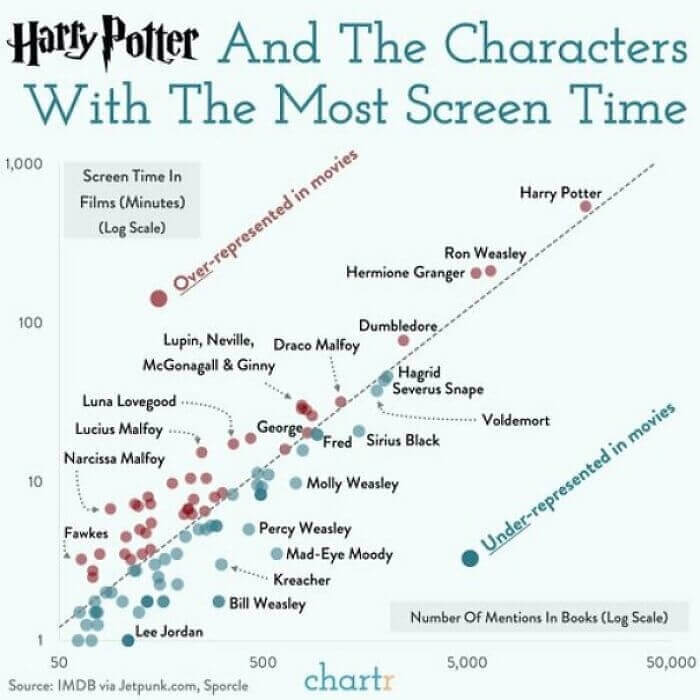
Perhaps the most famous movie based on a book is Harry Potter. This great chart shows us just how much the movie is different from the book when it comes to the characters “Screen Time vs. Mentions In The Books”.
2. The greatest, biggest, strongest...
Donald Trump’s Rally In Tulsa or as he likes to call it “the greatest, biggest, strongest, loudest, smartest rally ever” got a lot of media attention. Over the years as President, Trump gave us a lot of tears of laughter and a lot of other mixed emotions.

But nothing is more fun than to watch him brag, especially about the size of… well everything. When it comes to checking some of the claims that President Trump made, nothing is better than this chart right here.
3. All the Karens out there.
Karen. A perfectly normal name for a girl, right? Well, unfortunately for the Karens out there, over the past decade the name has formed into a pejorative term. In particular, it is used when someone wants to describe an entitled and demanding white woman.

This chart shows us how the name slowly dropped in the rankings from the top 10 popular names throughout the '40s all the way to the early ’70s. As the decade of bell-bottoms, disco and cultural change progressed the name Karen regressed. And with the age of memes and the internet, it just plummeted.
4. Lasts longer.
When it comes to lasting long, Duracel is the brand of batteries you want. At least per this chart. If you thought that all the batteries are the same in quality and it’s just the brand name on it, you were wrong just like many of us.

We are not quite sure why someone would even make this test...Whoever did make it though, unlike the Panasonic battery, had a lot of time on their hands. (Ba Dum Tss).
5. Now try the same with NY.
If Germans love something more than beer and sausages, it will probably be the rules, organization, structure, and punctuality. So it’s not a big surprise when we see the accuracy of this map below.

The Berlin subway map compared to its real geography is impressive. But as a practical joke, we would like to see the author of this map recreate the same with the New York City subway.
6. Question everything.
High blood pressure, cholesterol, and smoking are key risk factors for heart disease. Unfortunately, this is what kills most Americans per CDC. But the media will tell you a different story.

This chart does a great job of showing us that when it comes to the media ”if it bleeds it leads’. One thing to take away from this chart is that we need to question everything we see, read and hear.
7. Good guy?
Any donation is a good deed. But people being people, we want to know the juicy part of someone's charitable actions. And that is, how much did someone really donate in comparison to what they have.

Good guy Jack Dorsey, donated $1 billion to fight COVID-19. That equates to 21.74% of his net worth! But the catch? The donation is $1 billion worth of equity in Square (his company) to his Start Small LLC charity organization. Smart move.
8. Criminal actions.
The age-old question debunked in one simple picture. Pringle's actions are just criminal. Who needs air in that packaging? Give us more chips. Or add a dip in all that free space.

And Cheetos. We are just heartbroken. Everyone loves them and the cheesy fingers you get after eating them. But there is more air than Cheetos in that bag! We want to take this opportunity to thank the genius that made this chart and ate all those chips.
9. How about just warm?
Everyone feels the weather differently. But everyone has a preference when it comes to being hot or cold. You either hate the cold or hate the heat. Some care so much about the subject they even made a poll.

Having a close resemblance to the map you see during the voting season, this one shows us who likes what when it comes to temperature. We think being just warm is the best choice.
10. We have Netflix now.
If you were old enough to remember, long before Netflix, Blockbuster was the best thing ever in the 1990s and early 2000s. But unfortunately, the company made some bad business decisions.

As a kid, there was just no better feeling than grabbing a bunch of VHS tapes with 1990’s classic action movies. But just like its rise in popularity, the fall was quick. The company failed to keep up with the technologies and was crushed by competitors. But it’s ok, we have Netflix now.
11. I approve this message.
The year 2020 was a weird one in many respects. One of the weirdest things was when Kanye West made an announcement via Twitter on July 4, 2020, that he is running for President.

After all, the last presidential campaign resembled a circus so why not make it even a bigger one? And just like that Kanye spiced up the campaign. Fortunately, his “I approve this message" campaign ad got more views than votes.
12. Baking knowledge.
This one is less data-driven but sure is fun and relatable. Some fathers might just have their anxiety levels rise when it’s “Daddy?...(long pause)...”. For this dad it’s having to explain to his daughter where babies come from.

We hope this father was able to breathe, collect his thoughts, and baking knowledge. What we all should really practice is thinking like children. Life is so much simpler when we stop playing adults.
13. It get's better.
After a failed suicide attempt, this person decided to track his road to being healthier and happier and showing that you should never give up. A year of therapy and proper medication and days are getting greener.

No one is perfect and everyone has their own struggle. We applaud this person for the courage shown in sharing this personal chart online. We hope this will give other people a new outlook on life.
14. Imagine the snuggling.
This cool couple decided to make a blanket. Not just a regular blanket. A temperature blanket. Each line represents a day, the left side is the temperatures during the day and right are night temperatures.

There are 365 lines on this cool blanket. Yep, every single day they added a line. We love the dedication, creativity, and the result even more. Can you imagine just how cool snuggling under that blanket must be?
15. Mainstream media.
This chart shows how many people were killed as a result of terrorist attacks in 2017 in Europe and Africa. The blues is in Europe and red is in Africa. What else this chart shows us is how bias and just plain messed up mainstream media is.

A tragic event like a terrorist attack in Europe is something that the mainstream media will report on for weeks and Netflix will make a docuseries about it. A terrorist attack in Africa is often a news ticker at the bottom of the screen.
16. Altitude sickness.
This map shows the level of elevation tiles across the US. Unfortunately, Alaska or Hawaii wasn’t included but look at Colorado! We hear it’s even normal among Coloradans to know what is the elevation level you live on.

Yikes, just imagine all the East Coast folks moving to the West Coast and getting that altitude sickness. We also think it’s quite neat how easy it is to see where the Texas Hill Country gets its name from.
17. Alternative facts.
President Trump made a lot of claims over the four years of being the man in the White House. Many of those claims were false or misleading claims. Maybe he would call them alternative facts but the media just called it bs.

The author of this chart was clearly not a fan of his. Think of the effort it took to collect all the 30,573 claims, document them, label by topic and time, and produce this chart!
18. The bright side.
Monty Python sang “Always look on the bright side of life”. This is exactly what the result of this LinkedIn poll tells us. Often the best results are produced from bad situations.

In this case, it was Covid-19 that paved the way for digital transformation for many businesses. But it also changed the overall corporate culture of large and small organizations. Why would you fly for a meeting across the world when you can just Zoom? Or why even drive to the office downtown?
19. Seriously?
Ads. Everyone just hates them so much. Seriously, there is no one alive that likes ads. Especially when they are targeted and just creep you out by making you feel that big brother is watching.

This beautiful chart shows us the number of ads on each social media platform. We already knew that Facebook is super crowded with ads, but 28%?! We are not sure how Youtube is only 18% since every video you play nowadays has 100 ads in it.
20. Correlation Coefficient.
So here is another Presidential Campaign themed chart. Clearly, it’s not so favorable for Donald Trump's supporters...Some might say “you don’t need data for this one” but someone still decided to make it.

This was done so professionally it even lists the Correlation Coefficient. We bet the college degree snobs would argue Trump's supporters have no clue what that is. But hey, at least they have no college debt.
21. March 8.
March 8, international women's day. Every guy who loves his partner goes and buys the best-looking flower bouquet ( or at least he thinks it’s the best looking) and gifts his girl.

And right after that, he thinks to himself, “When is my day?”. And just like that the phone is out of the pocket and a Goole search for “International Men's Day?” is done. We wonder what happened in 2017 that the steady rise of search decreased that year…
22. The cats love it.
Remember the temperature blanket we listed earlier? Well here is another cool one! This time the year represented is 2016 and the girl who made it is showing the weather in Pennsylvania.

The blanket is big enough to cover an entire family sitting on both of the couches from the picture. And of course, the cats love the blanket. We wonder if they were being a pain playing with the knitting ball when the blanket was made.
23. Black Monday.
When you don’t have enough cash in your bank account, with full trust and confidence you can always depend on your bank… Not really. In the capitalist world, the bank robs you and not the other way around.

And this is exactly what happened on August 8, 2011, a day now commonly referred to as Black Monday. The US and global stock markets crashed leaving people in pure shock and disbelief that the system failed them.
24. The Browser Wars.
The kids today don’t know what it’s like to have Dial-up Internet with the weird noise coming over your phone. But back in 1995, it was the only thing out there and Netscape was the most popular browser in the new age.

And then The Browser Wars took place with Microsoft coming out victorious. Yep, internet explorer, the browser that is a meme was the coolest thing in 2002. In 2021 we are spoiled with a ton of browser choices.
25. The internet...
So this might be not the most accurate map out there but it’s pretty interesting that someone made the effort to make one. And after all, this is the internet so who cares. For some reason the northern countries like red.

The author forgot to add Japan to the map but that’s ok. We hear the Japanese are forgiving. Not sure Jamaicans will forgive them though because they were also not shown on the map.
26. Think twice.
Planes, they don’t seem to be safe, after all, you are up in the air! If something goes wrong, it goes wrong, end of the story. But they are the safest mode of transportation. Statistically speaking.

This chart gives us a perfect “everything is relative” example. So for all of you kids out there thinking about getting a nice motorbike, think twice. And what’s up with the ferryboats?! How come those things are not that safe...
27.
Do you know how everyone has been going on about global? And everyone else about it not being a big deal. Well, let’s put that juicy data on a graph and see what’s the deal.

Looks convincing? That’s because it’s true. For the past 2000 years, we have been experiencing more or less the same comfortable temperature patterns. And just when the industrial revolution came around that temperature deviation line grew a...
28. Start looking for a job.
So it’s 2019, after three years of hard work you just got your fresh commercial pilot license. 2020 hits and you start looking for a job… This chart shows the experience of one guy who did just that.

We love the fact that he has a sense of humor and went to post online about the experience. But we think he should even laugh harder at the fact that the companies even bothered to advertise the “open” positions!
29. That big.
So right before Corona became everything about 2020 there were the fires in Australia that the media reported on 24/7. Quickly the fires were forgotten by the mainstream media and a new favorite topic was born.

But let’s take a look at the size of that fire again. Just imagine all of Europe being engulfed in a fire. Yep, Australia is that big and the fires were huge, 60,000 square kilometers huge.
30.
We present to you Her Majesty Queen Elizabeth II. This chart is a year old and a few faces can easily be added. The Queen has been in “power” for so long, we bet that some of these selected (not elected) leaders, like Putin, envy her.

Now if you wish to write to her, the royal website says you should start your letter with a “Madam” and end it with 'I have the honor to be, Madam, Your Majesty's humble and obedient servant'. At least it’s not “filthy peasant”.
31. In the name of science.
For the guys out there, you know when you are taking a shower and the water is not going down the drain? And then you pull out a chunk of hair from the drain and it works. That is exactly what this chart looks like.

Can you imagine standing there all day and just pushing the same bicycles 800 hundred times? Not to mention you have to drag it back to the start point. All in the name of science.
32. Mondays and Fridays?
So here is an interesting chart that shows how public opinion changes over the decades...What really surprised us is that everyone had such a strong opinion on the matter. Why not just live and let live?

Now what is more confusing is that “sometimes wrong” line? What do they even mean by that? Like Mondays and Fridays? We people can be weird, cruel, and judgmental but the chart shows us that we come to our senses.
33. "Lyrics".
Remember that song from the late 90’s? It goes something like this “Around the world…” and that’s about it. Really. Those are the only lyrics to the hit song on an album that sold over two million copies.

So just like that those three simple words repeated over and over again gave the rise to Daft Punk. And the popularity of the song rose around the world. See what we did there.
34. Spikes.
Just like that, we went from the tragic death of Kobe Bryant to vaccines. This pretty cool chart shows us the data of google searches on 24 most looked up topics.

With each of the topics, we can see when it spikes, some of them are consistent. And of course almost more than half of those are Covid-19 related topics. This one really tells us a lot about who we are. Google really does the best job when it comes to summarizing a year!
35. Education...
The business of “giving” an education in the US is just dirty and at this point a bigger problem than the overall inflation. With those numbers, why do people still even bother to go to college in the states?

Why not get a degree from someplace where you will not become a slave of the system? How can it be more than the overall inflation!? We are puzzled as much as you are.
36. Reality TV.
Once in four years, the world is watching the biggest reality TV show ever produced. The US elections. Some years it’s more fun than the others and some years you have Donald Trump.

This cool chart shows us the outcome of the elections if only certain groups of the population voted in the latest elections. Do all older white men think alike? We wonder if they included the “Postal voting” in the data shown here.
37. LA County.
By now everyone probably heard that Los Angeles is terribly overpopulated. Do you want to know how really bad it is overpopulated? Here is a chart that is putting that data into an image.

Take the population of all of the states that are marked in blue and move them to Los Angeles County. Population density worldwide is really a curious thing to study. And if you know statistics that’s even better.
38.
This guy like most of us was bored in 2020. And just like many, he decided to work out and get in shape during quarantine. The only difference is he really stayed committed and tracked his progress.

His new year's resolution was to do 100 pushups in one go. And within 8 months at 49 years old, the guy did it. If you really put your mind to it the sky's the limit.
39. Tweets.
And we are back at one of our favorite topics. Donald Trump. This chart just shows us how mean-spirited people can really be. Being happy that he got the virus is just low.

Do you know what else is low? The number of likes on most of those tweets. We get that he is not the most popular fellow in the US, he would say otherwise, but no one should have that many likes on the “I am sick” tweet.
40. Trick or treating.
So just to brighten up the mood here is the last one that is less serious. This kid went trick or treating and got lots of chocolate candy! Mini snickers in particular.

Those that collected all the candy in the world on Halloween know the feeling of emptying the candy bag and having a feast. But this kid likes stats! So much that he checked the distribution of Snickers letters!